How TO - Responsive Image Gallery
Learn how to create a responsive image gallery with CSS.
Image Gallery
Resize the browser window to see the responsive effect:
Add a description of the image here
Add a description of the image here

Add a description of the image here

Add a description of the image here
Create a Image Gallery
Step 1) Add HTML:
Example
<div class="responsive">
<div class="gallery">
<a target="_blank" href="img_5terre.jpg">
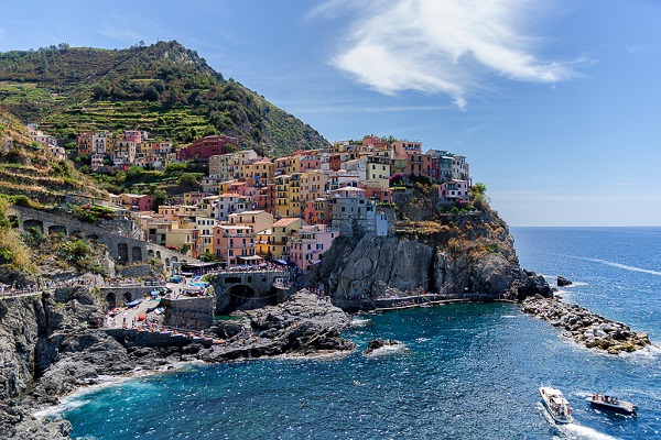
<img src="img_5terre.jpg" alt="Cinque Terre">
</a>
<div class="desc">Add a description of the image here</div>
</div>
</div>
<div class="responsive">
<div class="gallery">
<a target="_blank"
href="img_forest.jpg">
<img
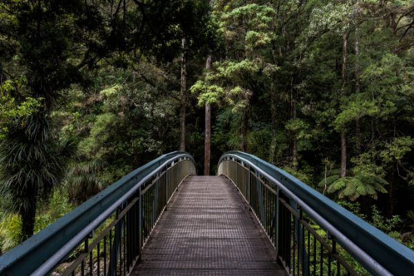
src="img_forest.jpg" alt="Forest">
</a>
<div class="desc">Add a description of the image here</div>
</div>
</div>
<div class="responsive">
<div class="gallery">
<a target="_blank" href="img_lights.jpg">
<img src="img_lights.jpg" alt="Northern Lights">
</a>
<div class="desc">Add a description of the image here</div>
</div>
</div>
<div class="responsive">
<div class="gallery">
<a target="_blank"
href="img_mountains.jpg">
<img
src="img_mountains.jpg" alt="Mountains">
</a>
<div class="desc">Add a description of the image here</div>
</div>
</div>
<div class="clearfix"></div>
Step 2) Add CSS:
This example use media queries to re-arrange the images on different screen sizes: for screens larger than 700px wide, it will show four images side by side, for screens smaller than 700px, it will show two images side by side. For screens smaller than 500px, the images will stack vertically (100%):
Example
div.gallery {
border: 1px solid #ccc;
}
div.gallery:hover {
border: 1px solid #777;
}
div.gallery img {
width: 100%;
height: auto;
}
div.desc {
padding: 15px;
text-align: center;
}
* {
box-sizing: border-box;
}
.responsive {
padding: 0 6px;
float: left;
width: 24.99999%;
}
@media only screen and
(max-width: 700px) {
.responsive {
width:
49.99999%;
margin: 6px 0;
}
}
@media only screen and (max-width: 500px) {
.responsive {
width: 100%;
}
}
.clearfix:after {
content: "";
display: table;
clear: both;
}
Try it Yourself »
Tip: Go to our HTML Images Tutorial to learn more about images.
Tip: Go to our CSS Style Images Tutorial to learn more about how to style images.
Copyright 1999-2023 by Refsnes Data. All Rights Reserved.